

When developers talk about viewports, they are actually referring to the screen resolution, which determines the number of pixels displayed on the screen in dimensions of width by height. For mobile web displays, developers prefer to describe screen sizes as media queries, making a distinction between portrait and landscape modes on iPhones and iPads that are visible if the user tilts their device.
Screen Resolution, Viewports, and Responsiveness
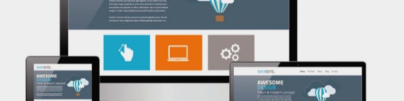
Web designers and developers must factor in these differences in screen orientation in order to produce a working user experience across all mobile devices. This means recognizing where the breakpoints are and rearranging elements until they are properly aligned on a webpage. Viewports scale down screen resolutions, allowing websites to be viewed more consistently with a readable layout on current smart devices.
Most developers are aware that it would be too time-consuming to design custom webpages for each and every device on the market. This includes older versions of the iPhone, Android, Samsung Galaxy, Google Pixel, and HTC models. (CSS-Tricks has an overarching list of media queries for standard devices.)
As such, developers have to take an alternative approach towards creating responsive layouts: First, the most common device sizes found on phones, tablets, and desktops are grouped together. Then, they define breakpoints using the relative sizing of content boxes that automatically adjusts them to fit the screen size.
My Experience with Testing Media Queries
Similarly, I can tell you from personal experience that designing websites using only device-specific breakpoints does not lend well to site visibility. While standard media queries are excellent for targeting viewports by min-width and height, they do limit the scope of your design so you don’t know if site elements are displaying correctly outside of those constraints.
There are numerous pitfalls such as overflowing columns of text or elements overlapping each other that result from these assigned breakpoints. I had to go back and edit my custom CSS to resize my footer, pagination, and navigation menus, replacing the units from pixels of fixed length to vh and vw relative to 1% of the viewport. For my site, the size of margins had to be changed to percentages to make them responsive.
When I made the switch over to content-specific breakpoints, it yielded some interesting results–I resolved an issue where my columns wouldn’t stack on mobile, compressing the featured image and excerpt. I also figured out how to hide blocks of content once the device detects a breakpoint at the min-width.
Relying on Device Width to Target Specific Layouts
Web developers can reference a list of media queries to get started on designing mobile sites; whether it’s adding lines of CSS to style content or using JavaScript to make elements interactive. Of course, they would need CSS styling to be active on a continuous spectrum of queries, therefore no gaps should exist between breakpoints.
With this in mind, let’s compare desktop screen sizes to tablet and smartphone displays. Notice how laptops have viewports ranging from 991px to 1600px. Conversely, the smallest tablets have a resolution of 767px to 1280px designated for portrait and landscape modes. Likewise, the breakpoint at 479px is when the viewport scales down to mobile phone screens.
On W3Schools is a table detailing the most up-to-date resolutions with respect to pixel sizes. They are listed as follows: (1920 x 1080, 1366 x 768, 1280 x 1024, and 320 x 640).
You can add this snippet of custom CSS to your WordPress site: @media only screen and (min-device-width: px) and (max-device-width: px) {Insert your code here}. Feel free to test it out and see what happens to your content boxes when you refresh the page.
Tying It All Together with Responsive Design
In light of new mobile-friendly techniques, web developers are no longer afraid of new mobile releases nor are they forced to resize elements in response to the latest version of updates. There are other ways to manage different screen sizes when testing client websites: They can include a responsive design using flexible grids, stackable image blocks, and layouts that will rearrange once it reaches a breakpoint.
Web developers have introduced content-specific breakpoints to detect when users will have trouble viewing content. With this change in perspective, they are now ready to tackle issues like navigating the form factor or designing for thumb controls. For larger screens, they will evaluate whether buttons are hard to reach with thumbs and design mobile webpages for a one-handed grip.
They’ve already fixed the problem of rendering images and graphics on Apple devices due to its high DPI of 1.5; The solution was to utilize a collection of fonts and SVG icons, stored as vector files that scale easily without dropping in quality.
Getting Websites to Perform on Mobile Screens
According to a survey conducted on smartphone use, approximately 75% of people prefer to swipe with their thumbs and roughly 49% hold them with one hand. They found that hard-to-reach primary controls make users uncomfortable when they are scrolling or trying to open menus.
One solution is to implement edge swipe to reveal hidden sidebars. The other is to install reachability into operating systems to slide apps downwards. They found that bottom positioning increased satisfaction from users as well. Depending on the user navigation, a floating action button may be necessary so it does not conflict with global actions positioned at the bottom.
What are some other ways that webpages can be designed for mobile accessibility or optimal usability? How should developers auto-adjust websites to limit the amount of content loaded?